Grayscale Coloring Tutorial: Basic How To

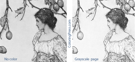
One of the questions I hear most often is how to color grayscale, so I took photos and notes of my latest colored page as I worked on it to try show you what I did.  Grayscale Coloring Tutorial: How To Color Grayscale

Materials

For this grayscale tutorial I will be using a copy of Arentine H. Arendsen’s Dutch Flowers: A Vintage Grayscale Adult Coloring Book https://amzn.to/2OVCPUU and a set of 72 Schpirerr Farben Coloring Pencils.  https://amzn.to/2RmjLS4
I colored directly in the grayscale coloring book.  I slipped a couple of pages behind the page I was working on to keep from having indentations in the page beneath, so that I could color it without issues later.
I would recommend pencils or markers for coloring grayscale, but not gel pens (I’d say gel pens if you’re really good at shading with gel pens.. there is a person who is coloring this book with glitter pens and doing a gorgeous job) but to start out I’d suggest you try pencils or markers that are somewhat transparent so the darks can show through.  I prefer to color grayscale with pencils, but some colorists add base layers in markers and then add more color with pencils.  There is no one way to do this, use whatever media you are most comfortable with, this post illustrates what I did for this page.

Materials - Grayscale Coloring Tutorial

Grayscale Coloring Overview

Some people are intimidated by coloring grayscale .  Grayscale coloring pages are pictures with the shading already figured out for you.  Try not to overthink coloring grayscale.  You can  try coloring it with just flat colors and be done (letting the darks show through), or add more pressure in the dark areas if you want more pronounced shading. Some think it’s supposed to be hard, be but it’s actually easier than coloring line art because the thinking about shading has already been done for you.

Getting Started

There are several ways to color grayscale.  What I do is I pick an area and a color (light, medium, dark), color the darker areas first, then add a layer of medium color (either the same color with less pressure, or a lighter shade) over the medium gray areas, then add a very light or no color over the light areas.  I work lightly and don’t press too hard so I can keep layering and build up color slowly.

Light Medium Dark Pencils - Grayscale Coloring TutorialHere are my three colors, I will be using Light Yellow (40), Bumblebee (50), and Vanilla Flower (80)

I start by adding a layer of Vanilla Flower to the darker areas of the flower I am coloring. Color Darks First - Grayscale Coloring Tutorial

Here is what it looks like after I colored the darksDarks Colored - Grayscale Coloring Tutorial

Then I used the Bumblebee pencil and added a light layer over the dark, and also extended beyond the darks and colored some of the medium shades of gray.Medium color next - Grayscale Coloring Tutorial

Next I’ll go over the darks and mediums with the light color (Light Yellow) and extend beyond the colored areas to add more color to the flowers.  I left a little white in the lightest areas.Adding light colors - Grayscale Coloring Tutorial

Because the three shades I used were very similar, the flower looks a little flat.  To add depth and interest, I pick a couple of colors that are nearby in the color wheel.  I picked a brighter color, this orange pencil (180) because it’s a dark color, I went over the darker areas.  They really pop after having it added.  Add a pop of color - Grayscale Coloring Tutorial

The orange is bright, so I tone it down a little with a more neutral shade to continue to add depth.   I used this Maple (110) pencil to help blend the orange into the flower and add a golden hue.  I sometimes err on the side of going too light with the pencils I start with because it’s always easier to add more dark colors to a coloring page than it is to remove them.Adding depth - Grayscale Coloring Tutorial

Next I will start working on the other flower on the page.  I wanted to make this one pink, so I pick my dark, medium, and light colors.  I used Magenta (250), Carnation (260), and Pink Lemonade (270)

Light Medium Dark - - Grayscale Coloring Tutorial

I start by using the Magenta pencil and coloring in the darker areas of the flower, working gently with a light layer. Color in the darks - Grayscale Coloring Tutorial

Then I added the second color (Carnation), again going over the darker area first, and beyond it to cover the medium gray.  Adding medium color - Grayscale Colroing Tutorial

Next I added a soft layer of the next color, Pink Lemonade over the darks and mediums and beyond.  I worked to add a very light layer and colored with less and less pressure to fade the color to white in the lightest areas of the flower.  Add lights - Grayscale Colroing Tutorial

For my next part of this page, I started work on the stems and buds.  for these type of flowers, the flower stems are a different, warmer color than the leaves.  so I add a warm color as a base color, I picked this Yellow (60) pencil and went over the darker areas.  This layer will help add warmth to the subsequent layers.Add a warm color - Grayscale Colroing Tutorial

Then I started adding some greens, I chose this warmer, Olive Green (580).  Add the medium color - Grayscale Colroing Tutorial
I did soft layers and added a little more and a little more each time, another warm green, cypress tree (590). A little more color - Grayscale Coloring How To

To liven up the colors, I picked a pretty Lime Green (570) and added it as my light color over all of the stems, adding less pressure to the lightest areas of the image.  Add the light color - Grayscale coloring how to

I moved on to the rest of the stems and leaves next.  I picked this Olive Green (580) as my dark and added a soft layer to all the darker areas of the leaves and stems.  Adding dark to the leaves - Grayscale Coloring How To

Here is a closer view of the picture above showing how I colored the darks on the stems and leaves.  Close Up - How to Color Grayscale

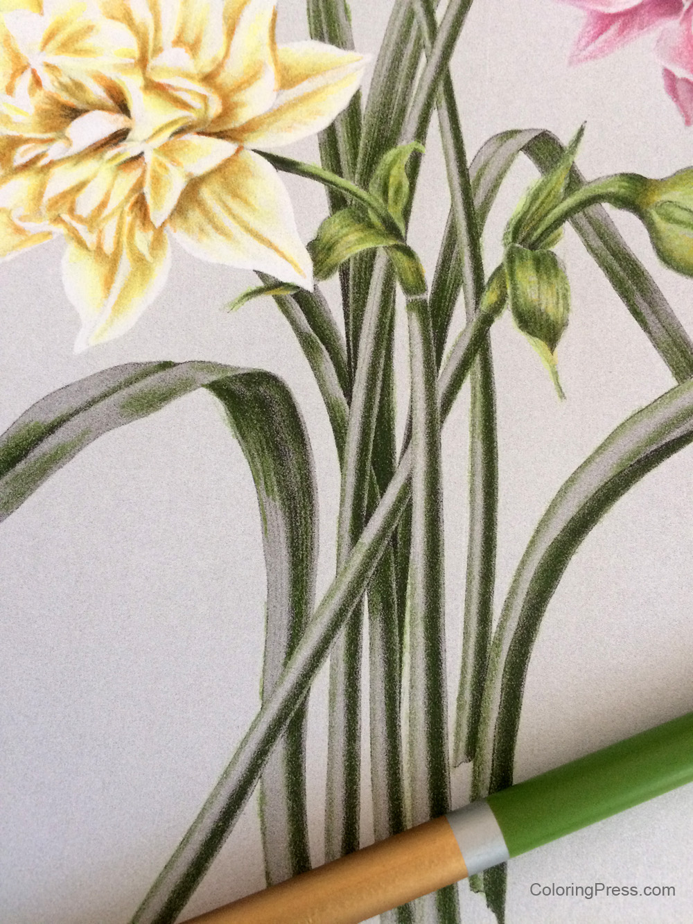
Next I added my medium color over the darks, and beyond to the medium grays and very lightly over the lights.  I used Apple Green (560) Adding medium to the leaves - Grayscale Coloring How To

The leaves were looking good, but the color looked flat.  So I added a layer of Lime (570) green to all the leaves and stems to add depth and more interest.  It perked up the leaves considerably!  Add some interest and perk up the colors with a light color

Next I added a little more contrast to the darks and depths to the color of the leaves and stems by adding some Cypress Tree (590) to the darks, adding more pressure to the darkest areas, and a little less to the other darks.Adding some darks for contrast - Grayscale Coloring How To

The main page is colored.  I went back and added a little color to the yellow flower, and added this color also to the warm parts of the stems and buds to add emphasis to the warmth of those parts of the picture.  I used some Light Yellow (40) to go over the yellow flower again and add more depth to the colors.  I added more pressure to the darker areas, trying to define the shape of the flower petals.Adding some warmth - Grayscale Coloring Tutorial

Then I went over the flower again to add a little more definition to the lighter areas of the petals and make sure they were distinct.  I used a light, warm color, Wheat (020) for this, and also added a layer to the warm areas of the stems and buds.  These light layers add a nice depth to the colors add realism, and keep them from looking flat/canned.Lightest lights - Grayscale Coloring Tutorial

I then colored the background.  Although this was a flat background, I used a gradation of four different colors from top to bottom to add interest: Blue Lagoon (470) on top fourth of the background, adding less pressure at the bottom of the layer, then slowly blended the second quarter of the background into a swath of Cerulean (460) across the background, next I used Summer Sky (450),  and segued into Cobalt Blue (440) at the bottom.  To add more interest I added a little bit of Deep Blue (420) to the very bottom. The finished page - - Grayscale Coloring Tutorial

The background is a large flat area and shows more texture.  One thing that could be done to soften the texture is to add some alcohol to blend the colors.  You can find more information on how to blend colored pencils in my post about colored pencil blending.

So there you have it, a breakdown of what I did to color this page.  This was my first time using Schpirerr Farben pencils  and they worked well for grayscale, I was able to make multiple light layers and they did not feel gummy or sticky.  They work well for blending and layering.  I will test them on line art next to see how they perform.

This grayscale book is not as detailed as others I have published, like Arthur Rackham’s Fairies and Nymphs.  That book has images with small details, and I had to make sure my pencils were sharp when coloring pages from that book.

You can try this page with different media, but what I’d recommend is that you pick something that is fairly transparent so the shadows show underneath.  The beauty of this type of coloring is that the lights and darks are already figured out for you.  Give it a try and let me know how it works for you!  Grayscale Coloring How To - A Basic Tutorial

Arentine H. Arendsen’s Dutch Flowers

Arentine H. Arendsen's Dutch Flowers Coloring BookMy newest grayscale book is published!  Arentine H. Arendsen’s Dutch Flowers is volume 4 of my Vintage Grayscale coloring book series.  This book has 39 beautiful vintage images from Dutch illustrator Arentine Arendsen.  These images have been carefully restored then made into special grayscale images made specifically for coloring.  Learn more about how I make my grayscale books.

The book is filled with delicate, detailed botanical illustrations for your coloring pleasure.
-39 exquisite, detailed vintage black and white grayscale images made just for grayscale adult coloring
-Printed in full size 8.5×11 single sided to avoid issues with bleed through on back of pages.
-The finished pages should be beautiful and would make a lovely display in groups of four or six framed in a study or foyer.
-There are some thumbnails below showing some of the images in the book.  These images should be simpler than my first two grayscale books.

Arentine H.  Arendsen’s Dutch Flowers is available on all Amazon locations including:
Amazon US https://amzn.to/2OVCPUU
Amazon UK https://www.amazon.co.uk/Arentine-Arendsens-Dutch-Flowers-Grayscale/dp/1731532423/
Amazon France https://www.amazon.fr/Arentine-Arendsens-Dutch-Flowers-Grayscale/dp/1731532423/
Amazon Germany https://www.amazon.de/Arentine-Arendsens-Dutch-Flowers-Grayscale/dp/1731532423/
Also available worldwide with free shipping via Book Depository https://www.bookdepository.com/Arentine-H-Arendsens-Dutch-Flowers-Ligia-Ortega/9781731532428

Arentine H. Arendsen's Dutch Flowers Coloring Book

Electronic Subscriptions Via Patreon and Gumroad

I have been listening to feedback and have been working on increasing access to electronic downloads.  I have finished setting up Subscriptions and also Patreon to make some of my pages more easily available via electronic downloads (Patreon is a subscription service where you sign up to receive different rewards from artists.) All coloring pages are never before published, they won’t be available for sale until later when they are published in a book. Everyone who joins my Patreon at any tier level by August 14 will receive 3 additional bonus coloring pages. https://www.patreon.com/ColoringPress
If the tiers don’t work for you, or Patreon is not your thing, I have added subscriptions to several of the genres I offer in my electronic downloads shop, so you can pick and choose your favorites to print on your choice of paper. https://gumroad.com/ColoringGifts
I hope this helps make electronic downloads more available and a better value for everyone! I’d love to hear any feedback you have!
Here is some additional information:

Bevalet’s Hummingbirds and Flowers

Bevalet's Hummingbirds and Flowers Book Front CoverMy newest grayscale book is now available for purchase!  Bevalet’s Hummingbirds and Flowers is volume 3 of my Vintage Grayscale coloring book series.  This book has 37 beautiful vintage images from vintage French illustrator Bevalet.  These images have been carefully restored then made into special grayscale images made specifically for coloring.  Learn more about how I make my grayscale books.

The book is filled with delicate, detailed hummingbirds and botanicals for your coloring pleasure.
-37 exquisite, detailed vintage black and white grayscale images made just for grayscale adult coloring
-Printed in full size 8.5×11 single sided to avoid issues with bleed through on back of pages.
-The finished pages should be beautiful and would make a lovely display in groups of four or six framed in a study or foyer.
-There are some thumbnails below showing some of the pages in the book.  These images should be a little simpler than my first two grayscale books.

Bevalet’s Hummingbirds and Flowers is available on all Amazon locations including:
Amazon US http://amzn.to/2A7HeRe
Amazon UK https://www.amazon.co.uk/Bevalets-Hummingbirds-Flowers-Grayscale-Coloring/dp/1979972214
Amazon France  https://www.amazon.fr/Bevalets-Hummingbirds-Flowers-Grayscale-Coloring/dp/1979972214
Also available worldwide with free shipping via Book Depository https://www.bookdepository.com/Bevalets-Hummingbirds-and-Flowers-Ligia-Ortega/9781979972215

Bevalet Hummingbirds and Flowers Book Sample Thumbnails


Warwick Goble’s Fairy Tales

Warwick Goble's Fairy Tales - A Vintage Grayscale Adult Coloring BookMy newest grayscale book is now available for purchase!  Warwick Goble’s Fairy Tales is volume 2 of my Vintage Grayscale coloring book series.  This book has 37 beautiful vintage images from two of Warwick Goble’s fairy tale books.  These have been carefully restored then made into special grayscale images made specifically for coloring.  Learn more about how I make my grayscale books.

The book is filled with vintage grayscale queens, kings, fairies, mermaids, and more for your coloring pleasure.
-37 exquisite, detailed vintage black and white grayscale images made just for grayscale adult coloring
-Printed in full size 8.5×11 single sided to avoid issues with bleed through on back of pages.
-Includes a sample image from my upcoming 3rd volume in the Vintage Grayscale series.  I am very excited about this next book and think you will enjoy it!

Warwick Goble's Fairy Tales - A Vintage Grayscale Adult Coloring BookWarwick Goble’s Fairy Tales is available on all Amazon locations including:
Amazon US  http://amzn.to/2x4dHnF
Amazon UK https://www.amazon.co.uk/Warwick-Gobles-Fairy-Tales-Grayscale/dp/1976137233/
Amazon France https://www.amazon.fr/Warwick-Gobles-Fairy-Tales-Grayscale/dp/1976137233/
Also available worldwide with free shipping via Book Depository https://www.bookdepository.com/Warwick-Gobles-Fairy-Tales-Ligi-Orteg/9781976137235

Colorist Showcase: Shawn Hallenbeck

One of the most enjoyable parts of being a coloring book author is seeing colorists put so much talent into coloring the pages I publish.  It truly adds meaning to the work I do and I wanted to share some of this wonderful work I see, so I will be featuring colorists on this blog on a regular basis in my Colorist Showcase series.  Today’s featured colorist is Shawn Hallenbeck.  She is an amazing colorist who is equally talented with line art and grayscale coloring pages.  She makes magic with Spectrum Noir markers – her shading and palette choices are simply amazing!  Seeing her work always lifts my spirits.  I was very happy when she agreed to share about her coloring journey with us.

Arthur Rackham's Fairies and Nymphs colored by Shawn Hallenbeck

How did you get into adult coloring books?
I’ve been coloring since I could hold a crayon. I really couldn’t find any good “adult” coloring books until the early 80’s. I really appreciated when the coloring craze hit, because now there’s a plethora of “adult” coloring books!  As far as how I got into the Coloring Groups on Facebook, my goddaughter gave me an Adult Sweary Coloring book for Christmas 2016 that had a link to the artist’s Facebook group, and the rest is history!

What are your main reasons for coloring?
It’s a form of meditation for me.

What are some of your favorite genres/types of coloring books/pages to color?
I like to color text and simpler designs (short attention span).

Coloring Gifts: Gifts of Thanks colored by Shawn HallenbeckDo you have any favorite supplies/tools?
All of them! I do love my Spectrum Noir sparkle pens.

Are there any coloring techniques that you have recently learned or that you’re particularly excited about? None that are recent, but I’m always learning!

Do you have any particular colors/palettes you like to use when you color?
Yes, I’m a sucker for hot pink, orange, and yellow together. Also, purple, aqua blue, and lime green!

Artful Flowers colored by Shawn HallenbeckAre there any supplies or techniques you would like to try someday?
I’d like to try some Caran D’ache and/or Holbein pencils, and watercolor techniques.

Do you prefer to color in coloring books or print out your pages? If so, do you have any particular paper you prefer?
It depends on the quality of the paper in the book & the medium that I’m using to color that page. If I’m using colored pencils, standard coloring book paper usually works for me. I also, cut the pages out of the books, I find it difficult to color in the book.
As far as preferred papers, I usually go for a 65lb cardstock.

Coloring Gifts: Gifts of Encouragement colored by Shawn HallenbeckDo you have any tips or advice to anyone who just discovered Adult Coloring?
Yes!
If you want to improve on your techniques, there are tons of informative videos on Youtube
You do NOT need expensive supplies! Learn techniques first. If you don’t, it won’t matter how many supplies you buy/own!
Do NOT compare your coloring to anyone else’s!
Don’t be afraid to share your work in the coloring groups.
Don’t be afraid to screw up!
Markers bleed through the paper, it’s what they are supposed to do!
Most importantly, HAVE FUN!

Coloring Gifts: Gifts of Thanks colored by Shawn Hallenbeck
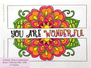
That is wonderful advice!  Thank you so much Shawn for taking the time to share some of your experience with coloring and your gorgeous colored pages.

Stay tuned for more Featured colorists in the near future!


Colroring Gifts: Gifts of Thanks colored by Shawn Hallenbeck

Simple Kaleidoscopes colored by Shawn Hallenbeck

How I Create Grayscale Books

I’ve received questions about my grayscale coloring books and thought I’d talk a little bit about how I make my books.

What is grayscale?  Grayscale is essentially an image that is not just line art but also retains some of the darks and lights in a picture.  I consider grayscale coloring like coloring on training wheels because having these gray colors showing where darks and lights are helps take the guesswork out of  shading.  I find coloring grayscale makes complex images easier to color, allowing me to relax and fall into coloring rather than stressing about where the light source is and where the shadows and lights in the image will go.

What is involved in making a grayscale coloring page?  There is a lot more to it than just removing color.  I spent a while researching how to do the best grayscale processing for coloring.  There are many ways to edit an image to change it to black and white, but not all give good colorable results.  In the Arthur Rackham illustration from an upcoming book below I show the most common way I see grayscale done (on the left) and the same original image after several rounds of processing I put it through to create a quality colorable grayscale page (on the right).

Grayscale Coloring

Common processing on left, my work on right

You’ll see there is a big difference in the images, you can see a lot more detail in the image on the right.  The dark areas and skin tones are a lighter color as well, leaving room for more luminous color in your finished page.  If you’ve noticed some colored grayscale pages having skintones that look rather gray and that the whole picture shows a gray cast to it, this is the reason why – they started out with an image that wasn’t really processed for coloring.

Other things I also do when I work on a page are painstakingly restoring the original work, as the usual images I work with are usually more than 100 years old they are bound to have damage or imperfections due to aging.  After restoration and cleanup, I do several rounds of preparation to get an image ready for coloring.   I use 5 different pieces of software to make my grayscale books.  I work hard to keep as many of the original nuances of the original artist’s work as possible.  I had someone ask why I don’t make my pages more smooth and perfect, but I want them to look as much as possible like the original with the only changes being processing it so it can be colored.  After the book is finished and assembled, I order a proof and test the hard copy by coloring some of the book.  If the image is too dark, I will go back to the files and work on them again and order another proof.  I do this several times until the images are just right, not too dark, not too light.  It takes me months to make a good quality grayscale book, but I think the results are worth it.  Many colorists have mentioned that my books are their first grayscale and that they fell in love with grayscale as a result.

Another question I receive regards what is public domain.  Public domain images are ones that are not subject to copyright laws.  What constitutes public domain is a very complex question.  A quick rule of thumb in the US and most of the world is that art enters the public domain 70 years after the artist’s death.  So even if an image is 70 years old, that is no guarantee that the image is public domain, it could have been created early in the artist’s career and the artist could even be still alive.  Some items (such as the King James Bible, for example) have perpetual copyright and cannot be used regardless of their age.  So thorough research needs to be done to determine whether an image is truly public domain.  I hand draw most of my books myself, but for my Vintage Grayscale series I use vintage images that were created 100 or more years ago.  I work to carefully research public domain rights for all the images in my books and also credit the original artist in the title and interior of my books.  My grayscale books are copyrighted, and the reason why is that even though I started out with a public domain image, by the time I restored and processed the image to convert it to a colorable page, it is a derivative work, no longer the same as the original image.  So the copyright in my books covers the many hours of work I do to process the original vintage image into high quality colorable grayscale.

There are many grayscale books out there.  There is a huge difference in quality.  Look carefully to make sure that the books you buy to color have images that are legally sourced, and that the images are processed precisely for grayscale coloring rather than merely having the color removed.  Sourcing quality grayscale books will result in a more enjoyable coloring experience and top quality finished colored pages.