I initially resisted alcohol markers, even though so many colorists raved about them. I didn’t like the way Sharpies smelled, and thought they were all like that. I found a small set of Bic Mark Its and they had much less strong odor, so I got their largest set. They blended well and I liked the results. No streaks like I got with water based markers, and different colors blended well into each other. The paper didn’t pill and the colors were nice and bright. I colored this page (from my book Coloring Gifts: Gifts of Encouragement, also available as an electronic download) with Bic Mark Its: The largest Bic Mark Its set was only 36 colors, and I loved the way they blended, but I wanted more range to work with. After asking around and doing some research, I decided to try a small set of Spectrum Noir markers. Like Copics (which are very expensive) Spectrum Noir markers are dual tipped, refillable, and you can replace their nibs – but they are a more affordable price point than Copics. Like Copics, they have a large color range (more than 200), you can buy them individually, in small sets of six or sets of 24. The sets do not overlap, so you can build up your collection slowly over time without buying duplicates. So I tried a small set. And I really loved them! It had so many colors to choose from and they also blended beautifully. This page (from my book Simple Mandalas, also available as an electronic download) was colored with Spectrum Noir markers:
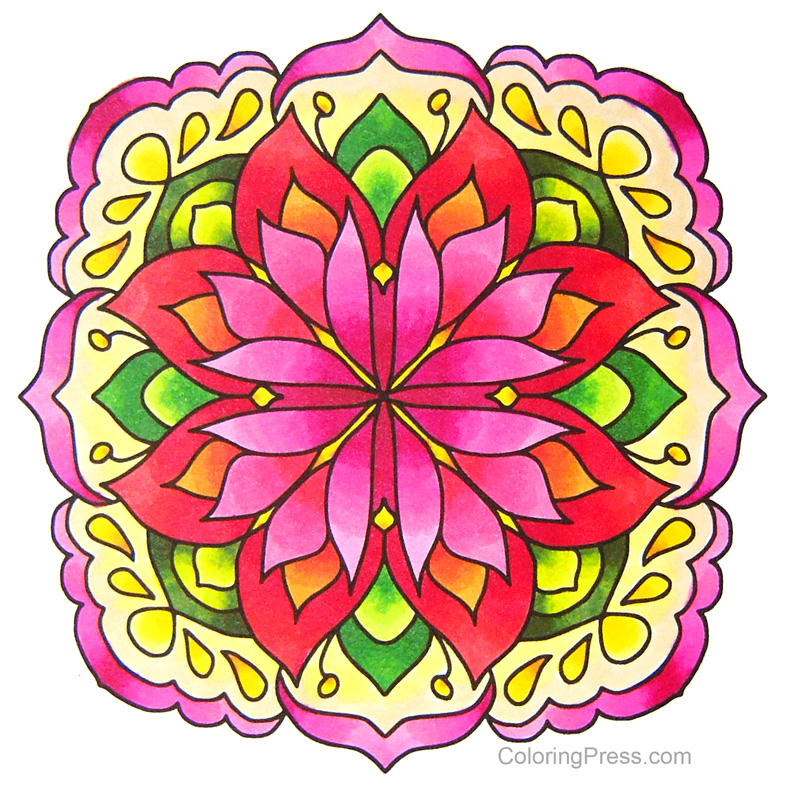 I’m slowly building up my collection of Spectrum Noir markers. They have expanded what I can do with markers and there are a lot of colors to choose from. But I was left with a small budget set with limited colors, and a high end set with lots of color choices, but nothing in between for everyday coloring. So I tried one of the mid range alcohol marker sets, the Sketch Set of 80 Alcohol Markers by Arrtx. They have a good range of colors and they blend well. They have numbers and this is what the colors look like sorted by number:
  Of course, to be able to use them, I spent some time sorting them into colors and made a new color chart.
  As you can see, they have a decent range of colors in the pinks, reds, blues, greens, and browns. The only thing they seemed to be a little short on are purples/violets. I used them to color the page below (from my book Coloring Gifts: Gifts of Encouragement, also available as an electronic download.) They were juicy (not one dry marker in the batch – I have heard that has been an issue with markers in this price range) they also blend well, and they come in a handy carrying case with labels on top so they are easy to store or take with you. They are also dual tipped – have a broad tip and a fine tip. They are not refillable. I recommend them as a good set of mid range markers for coloring. I also made the color chart above into an electronic download for anyone who’d like to use it. It’s available with my other electronic downloads.
  The paper you use makes a big difference for alcohol markers. Some paper, like office paper, is more likely to bleed outside the lines. I color in the books with alcohol markers and they work fine, but whenever I print out or copy pages for coloring, if I’m using markers, I choose Georgia Pacific Premium Cardstock, in white, 110 lbs. If you look closely, this paper has two sides: one is smooth (ideal for markers) and one that is lightly more textured, I use that side for pencils, or for markers with accents or additional shading in pencil (always add after the marker is completely dry!) Remember to store your alcohol markers on their sides so they will last longer, especially these dual tip ones, otherwise one end will have too much ink and the other will be dry. For the Arrtx makers, I just zip the case closed and set it on its side when I am finished using them. And of course, alcohol markers bleed through paper, even cardstock, so always have an extra 2-3 sheets of paper behind whatever you are working on to avoid any permanent marker stains.
Tag: supplies
Grayscale Coloring Tutorial: Basic How To
One of the questions I hear most often is how to color grayscale, so I took photos and notes of my latest colored page as I worked on it to try show you what I did. 
Materials
For this grayscale tutorial I will be using a copy of Arentine H. Arendsen’s Dutch Flowers: A Vintage Grayscale Adult Coloring Book https://amzn.to/2OVCPUU and a set of 72 Schpirerr Farben Coloring Pencils. https://amzn.to/2RmjLS4
I colored directly in the grayscale coloring book. I slipped a couple of pages behind the page I was working on to keep from having indentations in the page beneath, so that I could color it without issues later.
I would recommend pencils or markers for coloring grayscale, but not gel pens (I’d say gel pens if you’re really good at shading with gel pens.. there is a person who is coloring this book with glitter pens and doing a gorgeous job) but to start out I’d suggest you try pencils or markers that are somewhat transparent so the darks can show through. I prefer to color grayscale with pencils, but some colorists add base layers in markers and then add more color with pencils. There is no one way to do this, use whatever media you are most comfortable with, this post illustrates what I did for this page.

Grayscale Coloring Overview
Some people are intimidated by coloring grayscale . Grayscale coloring pages are pictures with the shading already figured out for you. Try not to overthink coloring grayscale. You can try coloring it with just flat colors and be done (letting the darks show through), or add more pressure in the dark areas if you want more pronounced shading. Some think it’s supposed to be hard, be but it’s actually easier than coloring line art because the thinking about shading has already been done for you.
Getting Started
There are several ways to color grayscale. What I do is I pick an area and a color (light, medium, dark), color the darker areas first, then add a layer of medium color (either the same color with less pressure, or a lighter shade) over the medium gray areas, then add a very light or no color over the light areas. I work lightly and don’t press too hard so I can keep layering and build up color slowly.
 Here are my three colors, I will be using Light Yellow (40), Bumblebee (50), and Vanilla Flower (80)
I start by adding a layer of Vanilla Flower to the darker areas of the flower I am coloring. 
Here is what it looks like after I colored the darks
Then I used the Bumblebee pencil and added a light layer over the dark, and also extended beyond the darks and colored some of the medium shades of gray.
Next I’ll go over the darks and mediums with the light color (Light Yellow) and extend beyond the colored areas to add more color to the flowers. I left a little white in the lightest areas.
Because the three shades I used were very similar, the flower looks a little flat. To add depth and interest, I pick a couple of colors that are nearby in the color wheel. I picked a brighter color, this orange pencil (180) because it’s a dark color, I went over the darker areas. They really pop after having it added. 
The orange is bright, so I tone it down a little with a more neutral shade to continue to add depth. I used this Maple (110) pencil to help blend the orange into the flower and add a golden hue. I sometimes err on the side of going too light with the pencils I start with because it’s always easier to add more dark colors to a coloring page than it is to remove them.
Next I will start working on the other flower on the page. I wanted to make this one pink, so I pick my dark, medium, and light colors. I used Magenta (250), Carnation (260), and Pink Lemonade (270)

I start by using the Magenta pencil and coloring in the darker areas of the flower, working gently with a light layer. 
Then I added the second color (Carnation), again going over the darker area first, and beyond it to cover the medium gray. 
Next I added a soft layer of the next color, Pink Lemonade over the darks and mediums and beyond. I worked to add a very light layer and colored with less and less pressure to fade the color to white in the lightest areas of the flower. 
For my next part of this page, I started work on the stems and buds. for these type of flowers, the flower stems are a different, warmer color than the leaves. so I add a warm color as a base color, I picked this Yellow (60) pencil and went over the darker areas. This layer will help add warmth to the subsequent layers.
Then I started adding some greens, I chose this warmer, Olive Green (580). 
I did soft layers and added a little more and a little more each time, another warm green, cypress tree (590). 
To liven up the colors, I picked a pretty Lime Green (570) and added it as my light color over all of the stems, adding less pressure to the lightest areas of the image. 
I moved on to the rest of the stems and leaves next. I picked this Olive Green (580) as my dark and added a soft layer to all the darker areas of the leaves and stems. 
Here is a closer view of the picture above showing how I colored the darks on the stems and leaves. 
Next I added my medium color over the darks, and beyond to the medium grays and very lightly over the lights. I used Apple Green (560) 
The leaves were looking good, but the color looked flat. So I added a layer of Lime (570) green to all the leaves and stems to add depth and more interest. It perked up the leaves considerably! 
Next I added a little more contrast to the darks and depths to the color of the leaves and stems by adding some Cypress Tree (590) to the darks, adding more pressure to the darkest areas, and a little less to the other darks.
The main page is colored. I went back and added a little color to the yellow flower, and added this color also to the warm parts of the stems and buds to add emphasis to the warmth of those parts of the picture. I used some Light Yellow (40) to go over the yellow flower again and add more depth to the colors. I added more pressure to the darker areas, trying to define the shape of the flower petals.
Then I went over the flower again to add a little more definition to the lighter areas of the petals and make sure they were distinct. I used a light, warm color, Wheat (020) for this, and also added a layer to the warm areas of the stems and buds. These light layers add a nice depth to the colors add realism, and keep them from looking flat/canned.
I then colored the background. Although this was a flat background, I used a gradation of four different colors from top to bottom to add interest: Blue Lagoon (470) on top fourth of the background, adding less pressure at the bottom of the layer, then slowly blended the second quarter of the background into a swath of Cerulean (460) across the background, next I used Summer Sky (450), and segued into Cobalt Blue (440) at the bottom. To add more interest I added a little bit of Deep Blue (420) to the very bottom. 
The background is a large flat area and shows more texture. One thing that could be done to soften the texture is to add some alcohol to blend the colors. You can find more information on how to blend colored pencils in my post about colored pencil blending.
So there you have it, a breakdown of what I did to color this page. This was my first time using Schpirerr Farben pencils and they worked well for grayscale, I was able to make multiple light layers and they did not feel gummy or sticky. They work well for blending and layering. I will test them on line art next to see how they perform.
This grayscale book is not as detailed as others I have published, like Arthur Rackham’s Fairies and Nymphs. That book has images with small details, and I had to make sure my pencils were sharp when coloring pages from that book.
You can try this page with different media, but what I’d recommend is that you pick something that is fairly transparent so the shadows show underneath. The beauty of this type of coloring is that the lights and darks are already figured out for you. Give it a try and let me know how it works for you! 
Paul Rubens Glitter Watercolors
 I have been testing some new glitter watercolors, love the pigmentation and the soft shimmer they have when viewed at an angle. This coloring page is from this month’s Patreon / Gumroad Subscriptions (Flower 3 ways, I used the grayscale for this one)
Patreon https://www.patreon.com/ColoringPress
Gumroad https://gumroad.com/ColoringGifts
Paul Rubens Glitter Watercolors https://amzn.to/2LNvnhX


Coloring Pencil Blending Tutorial
I am a guest blogger on Cleverpedia today with a tutorial on how to blend colored pencil. I go over several techniques and use a variety blending agents with an emphasis on nontoxic, easy to find materials. Check out the post here:
http://www.cleverpedia.com/colored-pencil-blending-techniques/

Black Widow Coloring Pencils
I have been hearing about Black Widow pencils for a while, but being who I am I was skeptical about them, not sure they’d live up to the hype. I recently received a set as a gift and am no longer skeptical. Loved the vibrant colors in these highly pigmented pencils, how they layered beautifully, and how easy they were to blend. They are soft, but not too soft.
I had to test drive these pencils when I received them, so I colored this page from my book Coloring Gifts: Gifts of Friendship. I went a little crazy with the colors but I wanted to test as many pencils as I could. This page is done with colors from the original Black Widow set. I fell in love with the pencils and am now the happy owner of all three sets, I have photos of sample pages of all of them below, scroll to see them all.
Black Widow pencils are available in three sets of 24 pencils (the original Black Widows, a Scorpion set and a Cobra set), each set has different colors for a total of 72 colors as of today. They are available on Amazon
Black widow pencils https://amzn.to/2Gr8TfY
Scorpion pencils https://amzn.to/2GqO2ti
Cobra pencils https://amzn.to/2GKrWW3
The above page is from Coloring Gifts: Gifts of Friendship, and it’s colored with the original Black Widows https://amzn.to/2Gr8TfY

This page above from Coloring Gifts: Gifts of Friendship was colored with the second, Scorpion set https://amzn.to/2GqO2ti
 This page above is from Simple Mandalas, and I colored it with pencils from the third, Cobra set. https://amzn.to/2GKrWW3
31 Rocks – Rock Painting Challenge
I have been enjoying doing some rock painting lately and thought it would be fun to have a challenge to do a little rock painting on a regular basis for a month. I thought for October it would be fun to paint 31 rocks in 31 days. If you want to participate in the challenge or finish the challenge, post your rocks any time! You can either post using the hashtag, or post your rock in the comments for that day’s rock on the #31Rocks Facebook page. To see each day’s rock click on the photos tab.
Here are the rules for the 31 Rocks Challenge:
-Paint a rock
-Share it online with the hashtag #31rocks
-Repeat every day in October (if it works better with your schedule, you can post your rocks every other day or even once a week, just figure out which span works better for you, stick to it, and share away!)
That’s all there is to it! I don’t have prompts or themes because I want everyone to participate as they are able and to paint or draw whatever they want on their rocks. If you don’t feel like doing something specific that day, paint a rock anyway. I have listed a few ideas for people who don’t want to draw or want to do simple abstract work at the end of this post. There are more on the 31rocks Facebook page and I will be adding a couple pages with ideas too, so check back.
Are you new to rock painting? Here are some beginner tips
If you’re new to this rock painting thing, here are some tips I’ve picked up since I started, and some ideas for supplies if you are looking to get started.
Where to find rocks:
If there isn’t a ready source of rocks near you like a beach, river, or even your own yard, you can buy rocks inexpensively at your local craft store, dollar store, or home improvement store. I buy bags of large landscape rocks from the garden section of my local home improvement store. Do not take rocks from businesses, nature preserves, or your neighbor’s yard – don’t be that person!
How to prepare rocks for painting:
Wash your rocks. If they are particularly grimy give them a soak in water. Then brush them while wet with a brush and soap if you’d like. Rinse and let dry completely either in the sun or a dry spot. Some people like to seal their rocks with gesso and add a layer of solid color or white acrylic before getting started. Some like to paint on the rock as it is.
Paint, Markers, other supplies:
I used a variety of things to paint rocks, many were supplies I already had around the house! Here are some of the supplies I use. This is by no means mandatory or an exhaustive list, but just a starting point if you don’t know where to start. I added links to make them easy to find and save you time.
Sharpie Twin Tip Permanent Marker Fine/Ultra Fine – Works great for outlining and for writing on back of rocks if you will be signing or leaving them for someone to find.
Acrylic Paint – the best value here would be a set of paints for crafts. I went to my local craft store and picked up a few colors I liked but then I needed to get more – so you might consider just going ahead and getting a whole set, it’ll cost less in the long run. 
Palette – I use a simple plastic palette to hold my paints, but don’t have to buy something if you don’t have it already, you could also use a ceramic plate.
Paintbrushes – I use a set of these inexpensive brushes pictured below. If you want to get something with more variety of tools, you could get one of these sets another idea for brushes and tools is further below. If you are willing to invest a little more on a good set of brushes, these are good for detail. 
Sharpie Metallic Permanent Markers – These work great on dark and gray rocks. When I use them on white rocks I outline with black.
Bic Mark-Its Permanent Markers – I use these on smooth white rocks. You could use Sharpies as well – these make for some quick rocks. The colors are not as vibrant as acrylic paints, but they do show. They do wear off easily if not sealed. The little cactus rock near the top of this page is done with Bic Mark-Its on a smooth white rock.
If you will be doing detailed drawings, Faber-Castell Pitt pens might be better than the sharpie. They are permanent ink and come in a variety of widths and nibs, including brush nibs. They are also available in color for more fun designs. 
I also have used a white paint marker in my experiments with it seems to work best directly on rocks. When I used it on top of acrylic paint to add details, I had mixed results.
Gold or silver paint adds a very nice touch to your rocks, they look particularly nice added to the mix in poured paint rocks.
I have also tried dotting with glitter glue, which gives rocks a bejeweled look. This one is not for perfectionists as it is very hard to get glue dots to make perfect circles. But if you’re OK with less than perfect dots, it’s fun to try. This glue is not waterproof, so the rock will definitely need to be sealed.
Once you are finished painting your rocks, it’s time to protect your work. A coat or two of varnish are good. You can brush on or spray varnish, I use matte, brush-on varnish, but you can use glossy varnish if you want your finished rocks to be shiny. These brush on varnishes work best on acrylic paint. If you are using markers, chalk markers, gel pens, or pens, spray varnish is your best bet to avoid smearing your designs. Please be safe and use it outdoors only. Several thin layers work best. Some folks recommend a thin layer of Mod Podge first then add sealant after the Mod Podge dries to keep the pens from running, but some people report smearing with that as well. Some people seal their rocks with Mod Podge – but that seems to work best for indoor only rocks. I tried several ways, and the glossy varnish above seemed to work best.
I have a copy of the book Art on the Rocks. I like it because it has instruction from three different artists, so there’s a variety of methods and styles.
The supplies below are on my wish list, but I have not tried them yet.
Uni Posca Paint Marker Pens – These look great because they are paint pens so it’s like having nice opaque acrylic paint with the convenience of a pen.
If you are looking for a higher quality set of acrylic paints, this set has a nice range of colors.
I have seen some rocks decorated with chalk markers. They turn out bright! But remember to seal them with spray sealant so they don’t run when they get wet.
My children love color shift paint. They call it bug paint after the shiny color shifting beetles they’ve seen. It would make for some neat rocks!
Some people use nail art tools to do detail work on their rocks or to make those cool dotted designs. 
Some people have reported using gel pens on their rocks. Also these white gel pens for white only designs or to add details. I have not tried yet but when I do I’ll update here. I’ve also heard of people using acrylic ink and dip pens, the type used for calligraphy.
On a Budget? Don’t want to draw things? Some ideas:
Are you on a budget? The supplies I posted at the beginning of this article were the lowest budget ones I could find but you don’t have to buy supplies. You can use masking tape and old nail polish on your rocks to make some bold modern colorblock rocks. Also, you don’t need all the supplies above. Until recently all I used to decorate rocks was my set of Bic Mark-Its! You could do paint or marker or metallic sharpies rather than all of them. I do recommend at least one black pen, though, it does make outlining much easier.
You can also try the colorblock with regular paint instead of nail polish. Or marble two or more colors of either paint or nail polish together using a toothpick. Just bear in mind that this technique could get a little messy. Protect your work surfaces accordingly. Another way to do colorblock rocks is to partially dip them in paint or acrylic ink and let them dry, then dip again at a different angle or leave as is. You can add decorations or writing with a Sharpie or a metallic Sharpie after they dry. My children have even added glitter glue to their stones – that’s where I got the idea to try it! They are not afraid to experiment with media. Check the challenge Facebook Page for other ideas both for media and for abstract no-drawing-required rocks.
A final word about the challenge and where to post:
The biggest takeaway here is that this is supposed to be a fun challenge! Rock painting is great for a challenge because there isn’t any need to be artsy or perfect. And rocks are small so they don’t take too much time to finish. Enjoy the challenge! As for what to do with your rocks – they make perfect RAOKs (Random Acts of Kindness) – check the 31 Rocks Facebook page throughout the challenge for ideas!
There is a Facebook page set up for the event, and we’ll be also be posting with the #31Rocks hashtag on Twitter, Instagram, and Pinterest! I can’t wait to see your rocks this October!
