I am making some of my exclusive single coloring pages available for download. I also have a couple of new books in the works. They are all available with my other electronic downloads: https://gumroad.com/coloringgifts

I am making some of my exclusive single coloring pages available for download. I also have a couple of new books in the works. They are all available with my other electronic downloads: https://gumroad.com/coloringgifts
I initially resisted alcohol markers, even though so many colorists raved about them. I didn’t like the way Sharpies smelled, and thought they were all like that. I found a small set of Bic Mark Its and they had much less strong odor, so I got their largest set. They blended well and I liked the results. No streaks like I got with water based markers, and different colors blended well into each other. The paper didn’t pill and the colors were nice and bright. I colored this page (from my book Coloring Gifts: Gifts of Encouragement, also available as an electronic download) with Bic Mark Its: The largest Bic Mark Its set was only 36 colors, and I loved the way they blended, but I wanted more range to work with. After asking around and doing some research, I decided to try a small set of Spectrum Noir markers. Like Copics (which are very expensive) Spectrum Noir markers are dual tipped, refillable, and you can replace their nibs – but they are a more affordable price point than Copics. Like Copics, they have a large color range (more than 200), you can buy them individually, in small sets of six or sets of 24. The sets do not overlap, so you can build up your collection slowly over time without buying duplicates. So I tried a small set. And I really loved them! It had so many colors to choose from and they also blended beautifully. This page (from my book Simple Mandalas, also available as an electronic download) was colored with Spectrum Noir markers:
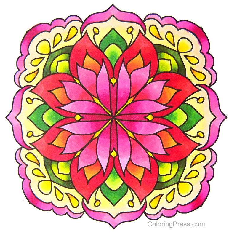 I’m slowly building up my collection of Spectrum Noir markers. They have expanded what I can do with markers and there are a lot of colors to choose from. But I was left with a small budget set with limited colors, and a high end set with lots of color choices, but nothing in between for everyday coloring. So I tried one of the mid range alcohol marker sets, the Sketch Set of 80 Alcohol Markers by Arrtx. They have a good range of colors and they blend well. They have numbers and this is what the colors look like sorted by number:
  Of course, to be able to use them, I spent some time sorting them into colors and made a new color chart.
  As you can see, they have a decent range of colors in the pinks, reds, blues, greens, and browns. The only thing they seemed to be a little short on are purples/violets. I used them to color the page below (from my book Coloring Gifts: Gifts of Encouragement, also available as an electronic download.) They were juicy (not one dry marker in the batch – I have heard that has been an issue with markers in this price range) they also blend well, and they come in a handy carrying case with labels on top so they are easy to store or take with you. They are also dual tipped – have a broad tip and a fine tip. They are not refillable. I recommend them as a good set of mid range markers for coloring. I also made the color chart above into an electronic download for anyone who’d like to use it. It’s available with my other electronic downloads.
  The paper you use makes a big difference for alcohol markers. Some paper, like office paper, is more likely to bleed outside the lines. I color in the books with alcohol markers and they work fine, but whenever I print out or copy pages for coloring, if I’m using markers, I choose Georgia Pacific Premium Cardstock, in white, 110 lbs. If you look closely, this paper has two sides: one is smooth (ideal for markers) and one that is lightly more textured, I use that side for pencils, or for markers with accents or additional shading in pencil (always add after the marker is completely dry!) Remember to store your alcohol markers on their sides so they will last longer, especially these dual tip ones, otherwise one end will have too much ink and the other will be dry. For the Arrtx makers, I just zip the case closed and set it on its side when I am finished using them. And of course, alcohol markers bleed through paper, even cardstock, so always have an extra 2-3 sheets of paper behind whatever you are working on to avoid any permanent marker stains.
While my books are all available for sale on Amazon, some colorists want to have the option to color pages on their favorite paper. I have reformatted all my line art books for electronic download and made them available for purchase so you can have them in electronic format if that is what you prefer. They are all available with my other electronic downloads: https://gumroad.com/coloringgifts
One of the questions I hear most often is how to color grayscale, so I took photos and notes of my latest colored page as I worked on it to try show you what I did. 
For this grayscale tutorial I will be using a copy of Arentine H. Arendsen’s Dutch Flowers: A Vintage Grayscale Adult Coloring Book https://amzn.to/2OVCPUU and a set of 72 Schpirerr Farben Coloring Pencils. https://amzn.to/2RmjLS4
I colored directly in the grayscale coloring book. I slipped a couple of pages behind the page I was working on to keep from having indentations in the page beneath, so that I could color it without issues later.
I would recommend pencils or markers for coloring grayscale, but not gel pens (I’d say gel pens if you’re really good at shading with gel pens.. there is a person who is coloring this book with glitter pens and doing a gorgeous job) but to start out I’d suggest you try pencils or markers that are somewhat transparent so the darks can show through. I prefer to color grayscale with pencils, but some colorists add base layers in markers and then add more color with pencils. There is no one way to do this, use whatever media you are most comfortable with, this post illustrates what I did for this page.

Some people are intimidated by coloring grayscale . Grayscale coloring pages are pictures with the shading already figured out for you. Try not to overthink coloring grayscale. You can try coloring it with just flat colors and be done (letting the darks show through), or add more pressure in the dark areas if you want more pronounced shading. Some think it’s supposed to be hard, be but it’s actually easier than coloring line art because the thinking about shading has already been done for you.
There are several ways to color grayscale. What I do is I pick an area and a color (light, medium, dark), color the darker areas first, then add a layer of medium color (either the same color with less pressure, or a lighter shade) over the medium gray areas, then add a very light or no color over the light areas. I work lightly and don’t press too hard so I can keep layering and build up color slowly.
 Here are my three colors, I will be using Light Yellow (40), Bumblebee (50), and Vanilla Flower (80)
I start by adding a layer of Vanilla Flower to the darker areas of the flower I am coloring. 
Here is what it looks like after I colored the darks
Then I used the Bumblebee pencil and added a light layer over the dark, and also extended beyond the darks and colored some of the medium shades of gray.
Next I’ll go over the darks and mediums with the light color (Light Yellow) and extend beyond the colored areas to add more color to the flowers. I left a little white in the lightest areas.
Because the three shades I used were very similar, the flower looks a little flat. To add depth and interest, I pick a couple of colors that are nearby in the color wheel. I picked a brighter color, this orange pencil (180) because it’s a dark color, I went over the darker areas. They really pop after having it added. 
The orange is bright, so I tone it down a little with a more neutral shade to continue to add depth. I used this Maple (110) pencil to help blend the orange into the flower and add a golden hue. I sometimes err on the side of going too light with the pencils I start with because it’s always easier to add more dark colors to a coloring page than it is to remove them.
Next I will start working on the other flower on the page. I wanted to make this one pink, so I pick my dark, medium, and light colors. I used Magenta (250), Carnation (260), and Pink Lemonade (270)

I start by using the Magenta pencil and coloring in the darker areas of the flower, working gently with a light layer. 
Then I added the second color (Carnation), again going over the darker area first, and beyond it to cover the medium gray. 
Next I added a soft layer of the next color, Pink Lemonade over the darks and mediums and beyond. I worked to add a very light layer and colored with less and less pressure to fade the color to white in the lightest areas of the flower. 
For my next part of this page, I started work on the stems and buds. for these type of flowers, the flower stems are a different, warmer color than the leaves. so I add a warm color as a base color, I picked this Yellow (60) pencil and went over the darker areas. This layer will help add warmth to the subsequent layers.
Then I started adding some greens, I chose this warmer, Olive Green (580). 
I did soft layers and added a little more and a little more each time, another warm green, cypress tree (590). 
To liven up the colors, I picked a pretty Lime Green (570) and added it as my light color over all of the stems, adding less pressure to the lightest areas of the image. 
I moved on to the rest of the stems and leaves next. I picked this Olive Green (580) as my dark and added a soft layer to all the darker areas of the leaves and stems. 
Here is a closer view of the picture above showing how I colored the darks on the stems and leaves. 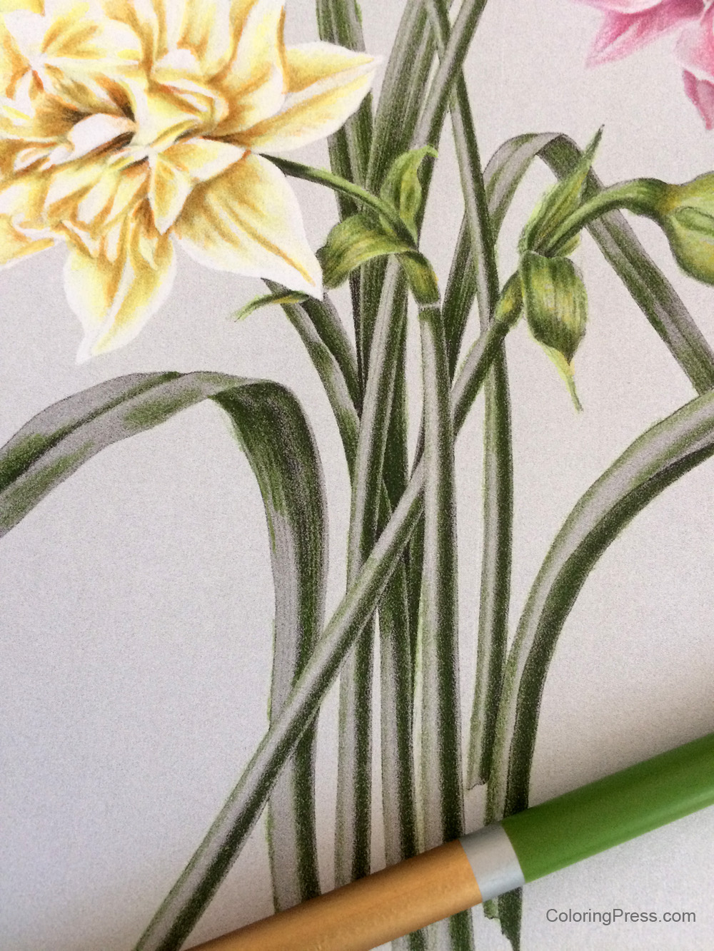
Next I added my medium color over the darks, and beyond to the medium grays and very lightly over the lights. I used Apple Green (560) 
The leaves were looking good, but the color looked flat. So I added a layer of Lime (570) green to all the leaves and stems to add depth and more interest. It perked up the leaves considerably! 
Next I added a little more contrast to the darks and depths to the color of the leaves and stems by adding some Cypress Tree (590) to the darks, adding more pressure to the darkest areas, and a little less to the other darks.
The main page is colored. I went back and added a little color to the yellow flower, and added this color also to the warm parts of the stems and buds to add emphasis to the warmth of those parts of the picture. I used some Light Yellow (40) to go over the yellow flower again and add more depth to the colors. I added more pressure to the darker areas, trying to define the shape of the flower petals.
Then I went over the flower again to add a little more definition to the lighter areas of the petals and make sure they were distinct. I used a light, warm color, Wheat (020) for this, and also added a layer to the warm areas of the stems and buds. These light layers add a nice depth to the colors add realism, and keep them from looking flat/canned.
I then colored the background. Although this was a flat background, I used a gradation of four different colors from top to bottom to add interest: Blue Lagoon (470) on top fourth of the background, adding less pressure at the bottom of the layer, then slowly blended the second quarter of the background into a swath of Cerulean (460) across the background, next I used Summer Sky (450), and segued into Cobalt Blue (440) at the bottom. To add more interest I added a little bit of Deep Blue (420) to the very bottom. 
The background is a large flat area and shows more texture. One thing that could be done to soften the texture is to add some alcohol to blend the colors. You can find more information on how to blend colored pencils in my post about colored pencil blending.
So there you have it, a breakdown of what I did to color this page. This was my first time using Schpirerr Farben pencils and they worked well for grayscale, I was able to make multiple light layers and they did not feel gummy or sticky. They work well for blending and layering. I will test them on line art next to see how they perform.
This grayscale book is not as detailed as others I have published, like Arthur Rackham’s Fairies and Nymphs. That book has images with small details, and I had to make sure my pencils were sharp when coloring pages from that book.
You can try this page with different media, but what I’d recommend is that you pick something that is fairly transparent so the shadows show underneath. The beauty of this type of coloring is that the lights and darks are already figured out for you. Give it a try and let me know how it works for you! 
 My newest grayscale book is published! Arentine H. Arendsen’s Dutch Flowers is volume 4 of my Vintage Grayscale coloring book series. This book has 39 beautiful vintage images from Dutch illustrator Arentine Arendsen. These images have been carefully restored then made into special grayscale images made specifically for coloring. Learn more about how I make my grayscale books.
The book is filled with delicate, detailed botanical illustrations for your coloring pleasure.
-39 exquisite, detailed vintage black and white grayscale images made just for grayscale adult coloring
-Printed in full size 8.5×11 single sided to avoid issues with bleed through on back of pages.
-The finished pages should be beautiful and would make a lovely display in groups of four or six framed in a study or foyer.
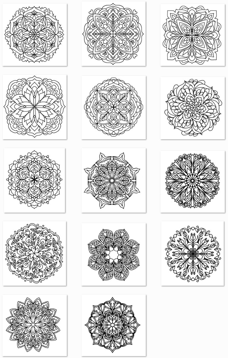
-There are some thumbnails below showing some of the images in the book. These images should be simpler than my first two grayscale books.
Arentine H. Arendsen’s Dutch Flowers is available on all Amazon locations including:
Amazon US https://amzn.to/2OVCPUU
Amazon UK https://www.amazon.co.uk/Arentine-Arendsens-Dutch-Flowers-Grayscale/dp/1731532423/
Amazon France https://www.amazon.fr/Arentine-Arendsens-Dutch-Flowers-Grayscale/dp/1731532423/
Amazon Germany https://www.amazon.de/Arentine-Arendsens-Dutch-Flowers-Grayscale/dp/1731532423/
Also available worldwide with free shipping via Book Depository https://www.bookdepository.com/Arentine-H-Arendsens-Dutch-Flowers-Ligia-Ortega/9781731532428

I have been listening to feedback and have been working on increasing access to electronic downloads. I have finished setting up Subscriptions and also Patreon to make some of my pages more easily available via electronic downloads (Patreon is a subscription service where you sign up to receive different rewards from artists.) All coloring pages are never before published, they won’t be available for sale until later when they are published in a book. Everyone who joins my Patreon at any tier level by August 14 will receive 3 additional bonus coloring pages. https://www.patreon.com/ColoringPress
If the tiers don’t work for you, or Patreon is not your thing, I have added subscriptions to several of the genres I offer in my electronic downloads shop, so you can pick and choose your favorites to print on your choice of paper. https://gumroad.com/ColoringGifts
I hope this helps make electronic downloads more available and a better value for everyone! I’d love to hear any feedback you have! ![]()
Here is some additional information:

 I have been testing some new glitter watercolors, love the pigmentation and the soft shimmer they have when viewed at an angle. This coloring page is from this month’s Patreon / Gumroad Subscriptions (Flower 3 ways, I used the grayscale for this one)
Patreon https://www.patreon.com/ColoringPress
Gumroad https://gumroad.com/ColoringGifts
Paul Rubens Glitter Watercolors https://amzn.to/2LNvnhX


I am a guest blogger on Cleverpedia today with a tutorial on how to blend colored pencil. I go over several techniques and use a variety blending agents with an emphasis on nontoxic, easy to find materials. Check out the post here:
http://www.cleverpedia.com/colored-pencil-blending-techniques/

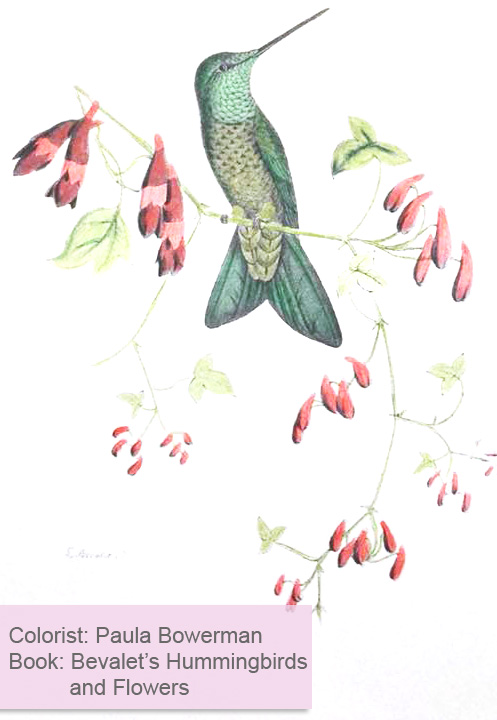
One of the most enjoyable parts of being a coloring book author is seeing colorists put so much talent into coloring the pages I publish. It truly adds meaning to the work I do and I wanted to share some of this wonderful work I see, so I will be featuring colorists on this blog on a regular basis in my Colorist Showcase series. Today’s featured colorist is Paula Bowerman. She is a prolific colorist who is talented in choosing bright, cheerful palettes to really make her colored pages stand out in the crowd. Her colored pages are so bright and cheery. I was happy when she agreed to share about her coloring with us.
 How did you get into coloring?
I have always coloured before it became acceptable for adults to colour . I would just colour from children’s books ! I just got more into it when Art Therapy magazine came out and yes I’m still collecting it ! We are at issue 1110 now !
What are your main reasons for coloring?
Main reasons for colouring are enjoyment ! I just love colouring !
 What are some of your favorite genres/types of coloring books/pages to color?
My favourite genres to colour are animals! I like fantasy and mythical too!
Do you have any favorite supplies/tools?
I really like using my Stabilo 68 pens and other markers . I have lots of different pencils but prefer pens so much easier to colour with in my opinion!
Are there any coloring techniques that you have recently learned or that you’re particularly excited about?
I tend to stick to 3 colours in most of my pictures , I find it very difficult to put loads of different colours on my pages !
 Do you have any particular colors/palettes you like to use when you color?
Blue tends to be a colour I use a lot of and red !
Are there any supplies or techniques you would like to try someday?
I would love to try copic markers one day but I’ll need to win the lottery for that lol.
Do you prefer to color in coloring books or print out your pages? If so, do you have any particular paper you prefer?
Much prefer colouring in my books than on loose sheets. I never take any pages out of my books either !
 Do you have any tips or advice to anyone who just discovered Adult Coloring?
To people just discovering colouring don’t stress over it , just get a pen and start colouring , it’s supposed to be fun and relaxing ! Enjoy ! Join some Facebook colouring groups , you’ll meet some lovely people on there who give out good advice !
Thank you so much again Paula, I appreciate learning more about you and your coloring. Stay tuned for more featured colorists in future blog entries!

 Simple Kaleidoscopes and Pocket Kaleidoscopes now have their respective volume 2 books:
Simple Mandalas: Easy to Color Designs
https://amzn.to/2I0nLTk
Pocket Mandalas: A Travel Size Mini Adult Coloring Book
https://amzn.to/2wiq2rK
These books have 50 hand drawn mandalas that are simple, with bold lines and larger spaces, but they are anything but boring! They are perfect for days when you don’t feel like facing an intricate coloring page or want room to do some shading and blending. The travel size book is perfect for taking with you any place you have to wait. The travel size book is top bound so both left handed and right handed colorists can easily reach the page, and they are printed single sided to allow for the use of markers (slip a couple pieces of paper or a piece of cardstock behind the page you are working on to avoid bleed through to other pages.
Simple Mandalas is also available worldwide with free shipping form Book Depository https://www.bookdepository.com/Simple-Mandalas-Ligia-Ortega/9781718757462
Here are thumbnails showing all pages in the book